Luxury Logo and Visual Identity Design: The Visual Codes of Prestige
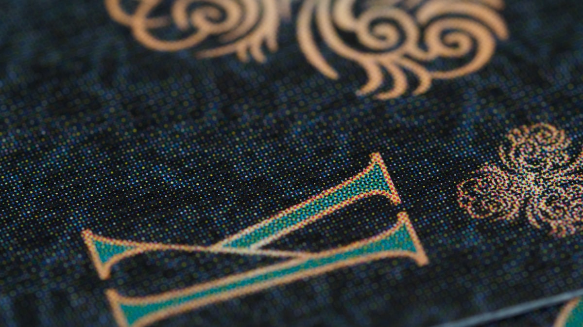
Luxury logo design, contrary to what most people think, is not about adding more detail but about removing everything unnecessary. Look at the logos of the world's most prestigious brands: almost all are simple, most consist of just a single word or a single letter, and none try to draw attention with a pile of gradients, shadows or ornamentation. The power of a luxury logo lies not in what it says but in what it refrains from saying. Simplicity is the visual language of trust and timelessness.
In this guide I address the shared DNA of luxury logos, how a strong visual identity is built, typography and monogram culture, special printing techniques such as gold foil, and the most common mistakes that keep a logo from looking luxury. I observed firsthand how meticulously visual identity is protected while working in the field on the Turkey projects of world-famous luxury brands. I explained the foundation of how a luxury brand is built earlier in the how to build a luxury brand guide. This article builds the visual face of that brand.
The Shared DNA of Luxury Logos
Despite coming from different sectors, different countries and different eras, luxury logos follow surprisingly similar principles. This similarity is not coincidence but the universal visual codes of prestige perception. The most prominent shared features are:
- Simplicity: A luxury logo does not make noise. Few elements, a clear form, respect for empty space. Simplicity shows that the brand is confident.
- Wordmark tradition: A large portion of luxury logos are in wordmark form, writing the brand's name in careful typography rather than a symbol. The name is carried with confidence.
- Monogram culture: The founder's initials or the brand's initials turn over time into a prestige symbol on their own. The monogram is the signature of heritage.
- Timelessness: A luxury logo does not lean on the fleeting trends of its era. It is designed to stand with the same power a decade later.
- The power of black and white: A luxury logo preserves its entire identity even in a single color. It uses color as a choice, not a crutch.
The common point of these principles is this: a luxury logo does not try to draw attention, it radiates trust. An ordinary logo says "look at me." A luxury logo says "my being here is enough." This difference in attitude sets the tone of the entire visual identity.
A luxury logo is completed not with the last element added but with the last element removed. Simplicity is where you arrive, not where you begin.
The Black-and-White Test: Is a Logo Truly Strong?
The simplest and most merciless method of measuring a logo's soundness is the black-and-white test. Strip the logo of all its colors, gradients and effects and place it in black and white only. If the logo still looks strong, recognizable and balanced in this state, it has a solid foundation. If it falls apart or becomes ordinary when it loses its color, it was in fact the color, not the logo itself, that was carrying it.
Luxury logos pass this test without exception because they draw their power from form, not ornamentation. This also creates a practical necessity: a luxury logo must work with the same clarity on an invitation embossed with gold foil, on a single-color engraved glass bottle, and on a small metal label. A color-dependent logo cannot survive in this multi-surface world. A strong visual identity must preserve itself even in the most demanding condition.
Typography: The Silent Language of Luxury
In luxury logo design, typography is often the logo itself. Because of the wordmark tradition, the form, spacing and balance of the letters directly determine brand perception. The choice of typography tells the brand's personality without saying a single word.
The Serif Tradition
Serif typefaces, with the fine strokes at their tips, evoke rootedness, trust and timelessness. A large portion of classic luxury brands prefer serif typography because serif refers to the past and to heritage. The fastest visual signal telling that a brand leans on a century-old tradition is a well-chosen serif letter.
Modern Sans-Serif
Newer and more contemporary luxury brands may turn to simple, geometric sans-serif characters. This choice evokes currency, clarity and minimalism. In recent years, many deeply rooted brands simplifying their logos and moving to sans-serif was a reflection of luxury's general tendency toward simplicity. These transitions always created debate, but the logic behind them was clear: reading more cleanly on digital screens and staying timeless.
The shared discipline of luxury brands in typography choice is this: obsessive attention to letter spacing. In wordmark logos the space between letters is often deliberately opened up. This airiness adds a breathing space and a sense of nobility to the product. Cramped typography feels cheap, airy typography feels prestigious.
Color, Gold Foil and Special Printing Techniques
In luxury visual identity the color palette is narrow and disciplined. Timeless tones such as black, white, cream and navy are generally preferred. Less color means more control and more prestige. A riot of color feels cheap, while a limited and select palette feels like mastery.
The real visual richness of luxury lies not in color but in materials and printing techniques. A logo feels luxury by how it lives on the paper or surface. The most commonly used techniques are:
| Technique | Effect | Common Use Area |
|---|---|---|
| Gold or silver foil | Shimmer, value, exclusivity | Invitation, packaging, business card |
| Emboss | Tactile depth, sense of craft | Box, label, letterhead |
| Deboss | Subtlety, hidden luxury | Leather goods, bound catalog |
| Spot UV | Play of light, fine accent | Packaging, cover design |
| Special paper and texture | Weight, tactile quality | Catalog, packaging, stationery |
The common point of these techniques is that they appeal to the sense of touch. Luxury is not only seen, it is felt. The weight of a box, the texture of a paper, the mark of an emboss on a fingertip, all feed prestige perception. This is why the catalog, packaging and print work of luxury brands is never left to an ordinary print run. In my catalog, packaging and print design work too, I treat this tactile layer as one of the brand's silent but most powerful prestige signals.
Monogram Culture and Emblem
One of the most powerful visual tools of the luxury world is the monogram. The founder's initials or the brand's initials gain, over time, a recognizability that does not even need the word. The monogram is both a signature and a seal. When it appears on a product, it silently declares that the product belongs to the brand's world.
The power of the monogram comes from repetition and consistency. Used in the same form, in the same places and with the same discipline for years, the monogram turns into a status symbol. For a new brand, a monogram is a strong investment but requires patience. A monogram gains prestige not on the day it is born but after being seen consistently thousands of times. This is why monogram design must be considered together with the brand's long-term visual identity strategy.
Mistakes That Keep a Logo From Looking Luxury
The visual mistakes that keep a brand away from the luxury segment are often made with good intentions. It is assumed that adding more effort, more effects, more color will create prestige, but the opposite happens. The mistakes I most often encounter in the field and in consulting processes are:
- Excessive effects. Shadow, reflection, imitation 3D emboss, glow. A pile of effects adds not power but cheapness to a logo. Luxury speaks with form, not effect.
- An abundance of gradients. Multi-colored transitions and bright gradients evoke technology or entertainment rather than prestige. A luxury palette is narrow and calm.
- Free or clichéd fonts. A ready-made typeface that everyone uses makes the brand ordinary instantly. Typography is the most visible test of luxury.
- A crowded composition. Cramming slogan, icon, frame and ornamentation into the same logo. Fear of empty space is a reflex foreign to luxury.
- Trend dependence. A logo leaning on the fleeting fashion of its era ages when the fashion passes. A luxury logo aims for timelessness.
- Inconsistent use. Even the best logo loses its power when used in different colors and proportions on every channel. Luxury perception cannot be preserved without a strong corporate identity guide.
The common source of these mistakes is failing to see that prestige is built by subtracting, not adding. Luxury logo design is an art of carving. The more unnecessary elements you can courageously remove, the more prestigious the result feels.
Rebrand: When Should a Luxury Logo Be Renewed?
Luxury brands change their logos rarely and with great care, because every change risks the recognition capital accumulated over years. Nonetheless, in recent years we have witnessed many deeply rooted brands simplifying their logos. Behind this rebrand wave were a few common justifications: reading more cleanly on digital screens, adapting to the general rise of simplicity, and reconnecting the brand with a new generation.
The general lesson from these renewals is this: a good luxury rebrand is not revolution but evolution. The brand does not erase its past, it distills it. It follows an approach that preserves recognizability but removes the unnecessary, that simplifies but does not weaken the identity. A rushed and radical logo change often loses more than it gains. This is why a luxury rebrand decision is not a visual choice but a strategic one, and must be handled together with the brand's entire positioning.
Let's Build Your Brand's Visual Identity Together
I am Sefa Aydın. As an Istanbul-based brand consultant and designer, I worked on the Turkey projects of world-famous luxury brands and observed firsthand how meticulously visual identity is protected as a discipline. I bring this perspective as complete visual identity, including logo, typography, packaging and print, to businesses wanting to build their own luxury or premium brand.
If you are curious about logo costs, you can review my logo design prices article, and if you are curious about the strategic foundation of a luxury brand, the how to build a luxury brand guide. If you want to build a timeless and prestigious visual identity for your brand, you can look at the scope of my corporate identity design service or reach me from the contact page. Prestige is felt at first glance. Let us design that first glance together.
Frequently Asked Questions
Why is a luxury logo simple?
A luxury logo is simple because prestige comes not from drawing attention but from radiating trust. Simplicity shows that the brand is confident and provides timelessness. Few elements, a clear form and respect for empty space make it possible for the logo to stand with the same power a decade later. A luxury logo is completed not with the element added but with the element courageously removed.
How can you tell if a logo is strong?
The simplest method is the black-and-white test. Strip the logo of all its colors, gradients and effects and evaluate it in black and white only. If the logo still looks strong, recognizable and balanced in this state, it has a solid foundation. If it falls apart when it loses its color, it means the logo was carried by color, not form.
What typography is used in luxury logos?
Classic luxury brands mostly prefer serif typography because serif evokes rootedness, trust and a reference to heritage. More contemporary luxury brands may turn to simple, geometric sans-serif characters. The shared discipline is obsessive attention to letter spacing. In wordmark logos the space between letters is deliberately opened up, because airiness adds a sense of nobility.
What is gold foil printing and why does it feel luxury?
Gold foil is a printing technique in which a metallic foil is transferred to the surface with heat and pressure. With its shimmer and depth it gives a sense of value and exclusivity. The reason it feels luxury is both its visual richness and its tactile layer. Luxury is not only seen, it is felt, and techniques such as gold foil feed prestige perception by appealing to the sense of touch.
What are the mistakes that keep a logo from looking luxury?
The most common mistakes are excessive use of effects, an abundance of multi-colored gradients, choosing free or clichéd fonts, a composition crowded with slogan and ornamentation, leaning on fleeting trends, and inconsistent use from channel to channel. The common source of these mistakes is failing to see that prestige is built by subtracting, not adding. A luxury logo is an art of carving.
Want to learn to do this with AI?
In one-on-one consulting sessions, live on your own project, I teach step by step how to do everything covered in this article with AI, not through a recorded course. If you'd rather have it done for you, write in and I'll get back to you the same day.
Message on WhatsApp Explore consultingFrom Rebel Co. Group

Sefa Aydın · AI Trainer & Consultant
An AI trainer and consultant who has worked on the Turkey projects of world-famous luxury brands. He teaches, hands-on, how every kind of work is done with AI: design, video, branding and vibe coding.
About Sefa Aydın → LinkedIn ↗