Business Card and Corporate Stationery Design: The Print-Ready Guide
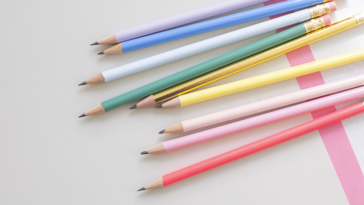
Business card and corporate stationery design is, even in the digital age, one of your brand's most tangible touchpoints: a business card passed hand to hand, a signed proposal or the letterhead on an invoice conveys your brand's level of professionalism within seconds. A well-designed corporate stationery set makes the difference between a disorganized business and a trustworthy brand visible.
This guide was prepared for business owners and entrepreneurs who want to professionalize their brand. As a Brand Manager who has worked with the printed corporate materials of luxury brands such as Dior, Fendi and Bvlgari, I will explain why the entire set, from the business card to the letterhead, must be designed as a single system.
What Does a Corporate Stationery Set Cover?
Corporate stationery is not just a business card; it is a whole that keeps your brand looking consistent in print and digital media. A standard set usually consists of these parts:
| Item | Purpose of Use | Priority |
|---|---|---|
| Business card | One-on-one introductions and sharing contact info | High |
| Letterhead | Formal correspondence, proposals and contracts | High |
| Envelope | Corporate mailings | Medium |
| Email signature | Brand consistency in digital correspondence | High |
| Invoice / delivery note template | Accounting and delivery documents | Medium |
| Presentation template | Proposal and pitch presentations | Medium |
When all of these parts share the same color, typography and logo usage, your brand becomes recognizable at every touchpoint. Having the parts made separately, at different times and by different people, breaks that consistency.
The 6 Rules of a Good Business Card Design
- Establish hierarchy: The name and title should be read first; contact information should stay in the background. Writing everything at equal size makes nothing stand out.
- Respect white space: Don't fill every centimeter of the card. Breathing space makes the design look expensive and professional.
- Choose a readable typeface: Fancy fonts printed in small point sizes can't be read. A business card is, above all, a functional document.
- Use brand colors: A business card should be an extension of your corporate color palette; random colors weaken the brand.
- Don't compromise on print quality: Paper weight, coating and cutting determine the feel the card leaves in the hand. Cheap printing creates a cheap brand perception.
- Give the right information: Include only the channels people will actually use to reach you; a crowded card looks like an indecisive brand.
Print and Digital Business Cards Should Be Considered Together
In 2026 many introductions begin in digital media; that's why, alongside the printed business card, a QR-coded or digital business card should also be part of the corporate set. The printed card gives the first impression, while the digital card transfers information easily. The two sharing the same visual language shows that your brand is consistent both offline and online.
What to Watch for Before Printing
Even the best design can go to waste with wrong print settings. Before sending to print, check these technical points:
- The color profile should be CMYK; the RGB colors you see on screen come out differently in print.
- Bleed should be added; make sure no white line is left at the edges during cutting.
- Resolution should be at least 300 DPI; low resolution creates blurriness in print.
- Text should stay sufficiently inside the cut line; text stuck to the edge can get cut off.
Why Cheap Stationery Design Costs More
A business that produces its business card from a template site within minutes looks, at first glance, like it saved money. But that card carries the same mold as thousands of other businesses and makes the brand invisible. Worse, when the business card, letterhead and invoice come from different sources, each looks like a different brand; the customer starts to wonder "is this really a professional company?" A set designed as a system from the start prevents this loss of trust from the very beginning.
Business cards and corporate stationery are where a logo lives not on its own but within a system. A corporate identity design process that builds all the parts from a single source with a consistent language, or a catalog, packaging and print design service for work requiring physical production, rescues your stationery from disorder.
Conclusion: A Small Card, a Big Impression
Business cards and corporate stationery are among your brand's cheapest yet most effective promotional tools. A consistent, quality and readable set passed hand to hand conveys your business's seriousness without needing a word. Think of the parts not one by one but as a system; keep the same color, the same typography and the same logo usage on every document.
If you'd like to design a cohesive corporate stationery set for your brand, from the business card to the letterhead, you can write to 0542 783 42 15 on WhatsApp or fill out the contact form. Let's prepare a consistent set that suits your brand's identity.
Frequently Asked Questions
What parts does a corporate stationery set consist of?
A standard set consists of a business card, letterhead, envelope, email signature, invoice/delivery note template and presentation template. Having all of them share the same color, typography and logo usage makes the brand recognizable across every medium.
What information should be on a business card?
The name and title should stand out, followed by only the contact channels that will actually be used. A crowded card gives the impression of an indecisive brand; simplicity shows professionalism.
What should I watch for in business card printing?
The color profile should be CMYK, bleed should be added, resolution should be at least 300 DPI, and text should stay inside the cut line. Paper weight and coating also directly affect the feel the card leaves in the hand.
Does a digital business card make the printed one obsolete?
No, the two complement each other. The printed card gives a strong first impression, while a QR-coded or digital card transfers information easily. The two sharing the same visual language shows that your brand is consistent both offline and online.
Why should I choose custom design over a template business card?
Template cards carry the same mold as thousands of other businesses and make your brand invisible. Custom design integrates with your corporate color and typography, making your brand distinctive and trustworthy.
Is it a problem to have the stationery parts made separately?
Yes. A business card, letterhead and invoice coming from different sources look like different brands and create a loss of trust. Having the entire set designed from a single source, as one system, guarantees consistency.
Prefer to leave this to a professional?
I handle your brand, design, social media, advertising and print work from a single point. Tell me what you need and I'll get back to you the same day.
Message on WhatsApp Explore servicesSefa Aydın · Brand Manager
A brand manager who has worked on the Turkey projects of luxury brands such as Dior, Fendi and Bvlgari, offering full-scale digital and print services to brands. Also teaches hands-on courses on graphic design, video editing and AI.
About → LinkedIn ↗